The New York Times recently posted an article explaining why Pantone chose two colors for 2021 and the meaning behind the color duo. I found it an interesting read and will definitely keep these two colors in mind as I work on print design projects throughout the year.
What are your thoughts on these colors? Do you believe they accurately represent what people need and will be communicating in 2021?
https://www.nytimes.com/2020/12/09/style/pantone-color-2021-ultimate-gray-illuminating.html

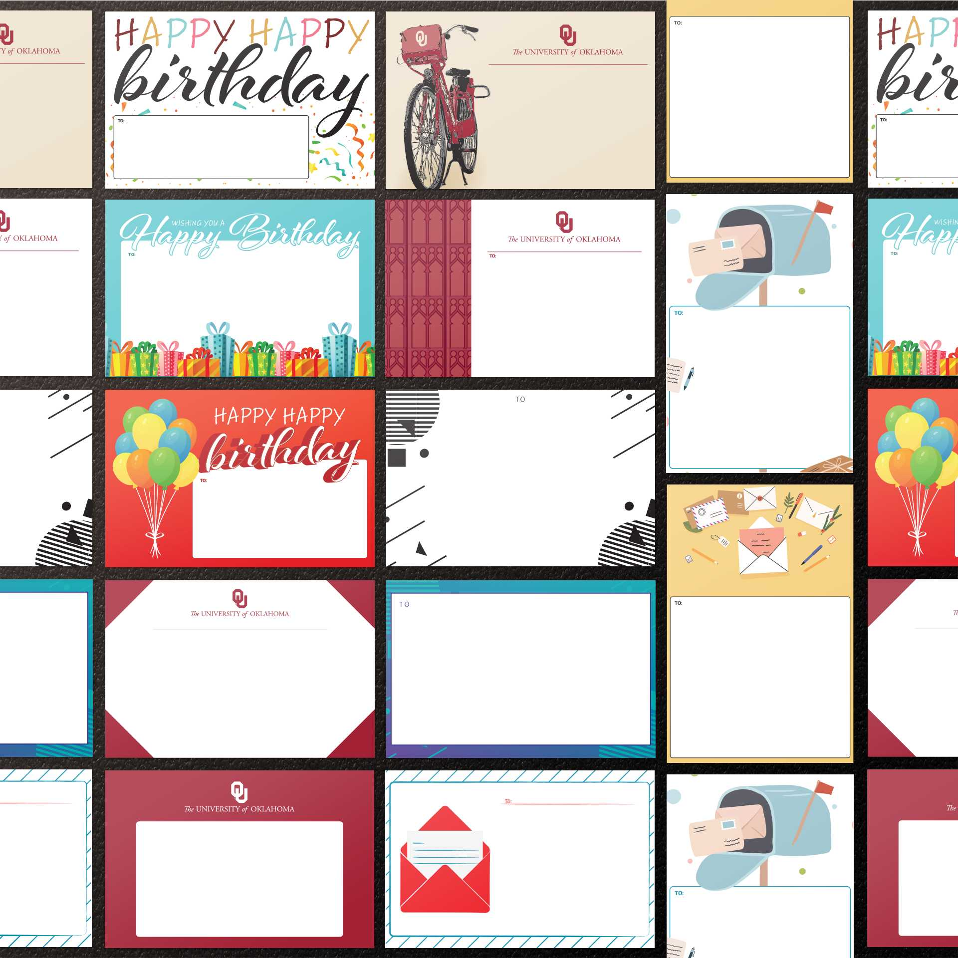
I recently finished a design project for OU's Crimson and Cream Copy Center & Student Post OFfice. They wanted some fun, creative shipping labels that students could purchase and use on their packages. They requested some birthday, university, and generic themed labels. Here are the final designs!
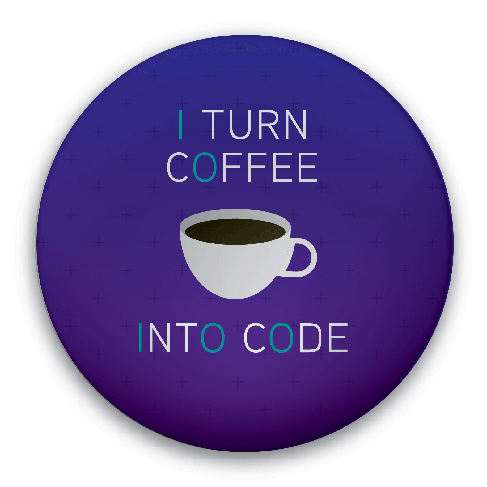
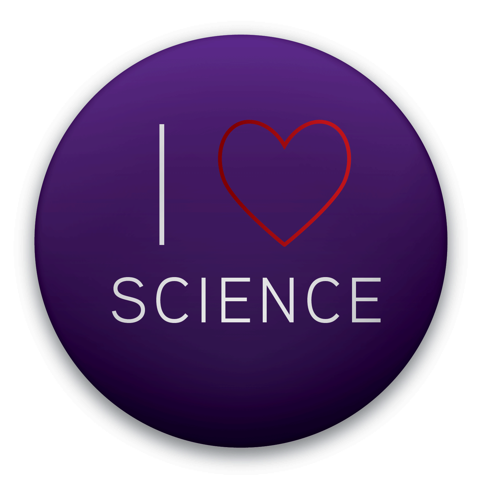
What do you think about this set of pin buttons geared towards students studying or interested in technology and IT?
Share something you like and something you would do differently in the comments! 😄 AND make sure to stay tuned for the next set of themed buttons!